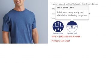
Soft Feel Heat Transfers
For many years working at trade shows, I have always had people come up to me and say, why do some designs “feel like a transfer” I would always say, what do you mean “feel like a transfer” and they would say something like, “well, I don’t know, but they feel like a rubber patch”. I would say, do you think screen printing feels better? They would always say, “Yes, screen printing feels much better than a heat transfer”. So after a little conversation, I would walk them around our display and remove them from the wall. Once they felt the sample transfers, they would quickly say, “now this does not feel like a transfer!”. Why do they feel better? The answer to make soft feel heat transfers is in the artwork!
Making the Most with Less Color
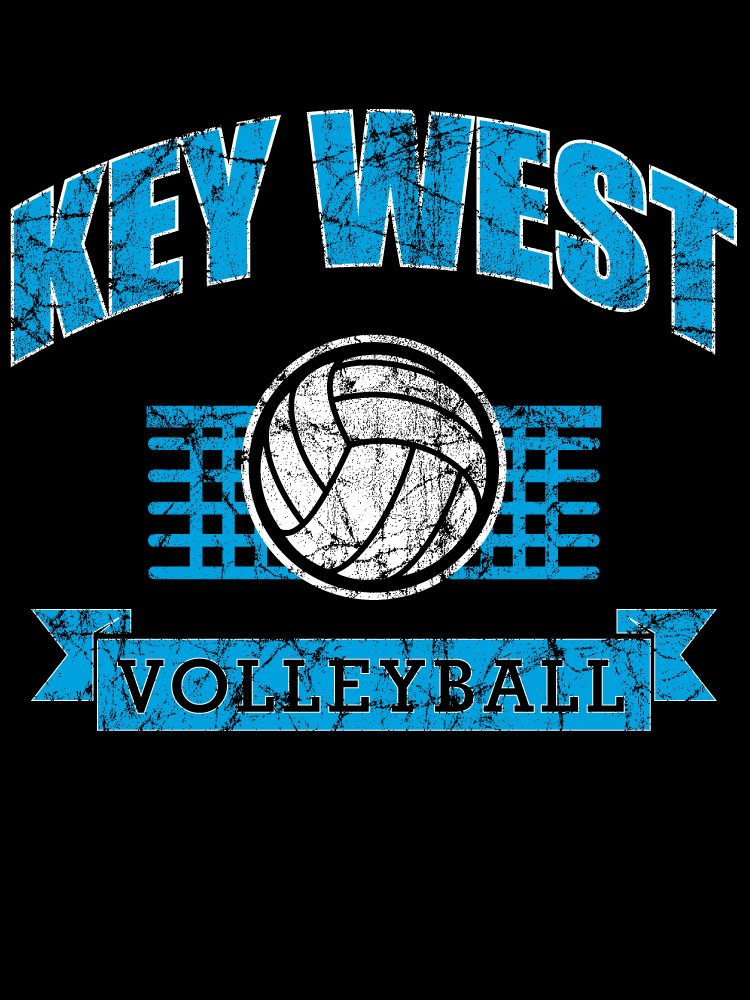
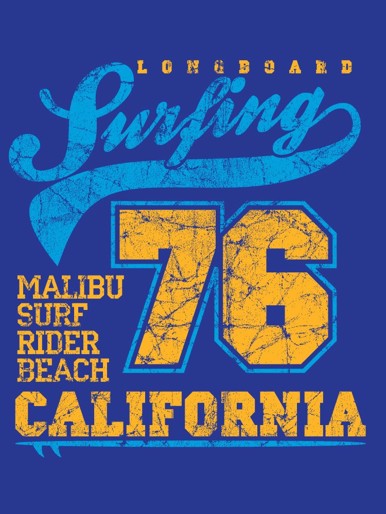
Believe it or not, heat transfers can be as soft and stretchable as a direct screen print. What makes the screen print or transfer feel like a rubber “tire patch” is the amount of ink coverage in the design. Over the many years of seeing all types of logos and designs, I can always tell which designs are going to have the “tire patch” look. Sometimes, there is no avoiding a lot of coverage. It really only matters if you plan on decorating a wearable garment. Keep in mind, the heavier the fabric (such as a sweatshirt), the less this will be an issue with your customers. I would suggest you review artwork and point out some of the concerns at the time the customer places the order.


Making the Most with Less Color – A few helpful tips.
No matter if the artwork is a 1 color transfer or a 2 color heat transfer you can make your design not only look better, but feel better on the shirt. Use the shirt color as one of your design colors when possible. For example, if you are planning to print the design on a black shirt, then use white ink and the secondary ink color to allow the background color to show through.
- “Knock out” fill colors
- Use typography which has an outline stroke
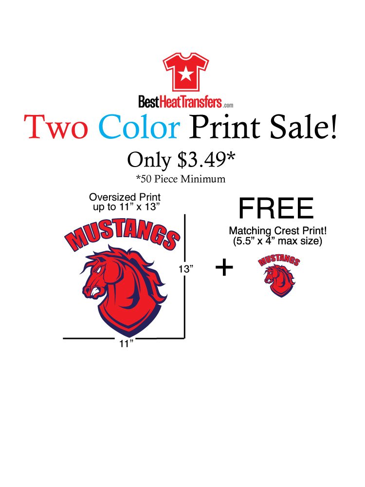
- Make a one color look like a 2 color
- Make a two color heat transfer look like a 3 color
- Design your artwork on a black or colored background
- Create several layers so you can view the artwork on multiple background colors
- Add a distressed pattern and “knock out” large areas of ink.
- Be careful to select fonts which may help reduce ink coverage
- Avoid solid “Blocks” of ink coverage


